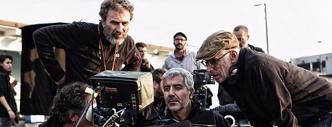
DP Italo Petriccione has been a part of more than 50 feature films since 1986. Over the years, he often joined forces with director Gabriele Salvatores on set and beyond. “I started working with him on ‘Marrakech Express’ in 1988 and since then our collaboration has never stopped,” says Petriccione. “If we add that our friendship has now exceeded half a century, there is no need to emphasize our professional understanding. For a long time, I’ve been trying to get Gabriele to use black and white. As a young man I was passionate about photography and I used to shoot and print strictly in black and white.” With “Il ritorno di Casanova” (“The Return of Casanova”), Petriccione finally succeeded in convincing director Salvatores to implement this special color design. The new film, starring Fabrizio Bentivoglio, Toni Servillo, and Sara Serraiocco, features a story in two different time periods—one captured in color, the other one in black and white.
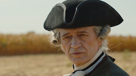
“The Return of Casanova” features a story with two different time periods and color designs
“The Return of Casanova” is set in two time periods. How did you manage the visual style?
The film tells the story of Oscar-winning director Leo (Toni Servillo), who, having finished shooting his last film, is in the grip of anxiety, frightened by the return to his complicated daily life. Age and fears are the same as those of the protagonist of his new film, a mature Casanova (Fabrizio Bentivoglio), who also suffers from his life declining due to the passing of time. As old age approaches, his capacity for seduction vanishes, just as the aging director’s hold on the public vanishes; audiences are now attracted to a young director who is popular with critics. They are two mirror characters with the same anxieties, who see the youth of others as a constant threat to their status. Although separated by almost three centuries, the two are very close emotionally. Gabriele and I discussed for a long time about how to interpret the different time periods. In the end, we decided to use color for the costume scenes and black and white for the modern-day scenes.
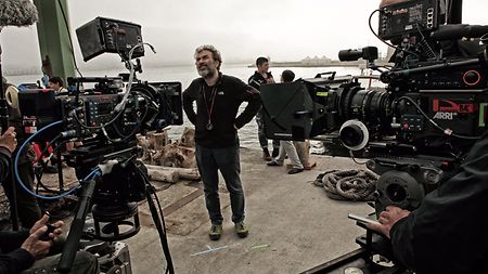
DP Italo Petriccione and director Gabriele Salvatores have worked together on projects for more than 30 years
Were you given any particular references?
For the color part, with its candlelit atmospheres, the sumptuousness of the locations and costumes and a density of the image inspired by film, we had “Barry Lyndon” in mind, but not only. For the contemporary part, characterized by a dry, etched black and white, with strong contrasts and declared compositional symmetries that revive the discomfort of everyday life, we drew inspiration from the black-and-white cinema of Gordon Willis with Woody Allen or that of Martin Scorsese. Another reference were the beautiful images of great Italian DPs of the 1950s and 60s, such as Leonida Barboni, G.R. Aldo, Peppino Rotunno, and many others of that fantastic era of our cinema.
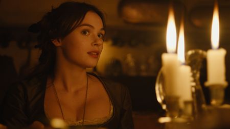
Captured in color: The costume parts of “The Return of Casanova”
How many weeks of shooting did you do for “The Return of Casanova”? Which locations did you choose?
With a budget of seven million euros, we shot five weeks in the Veneto region, between the provinces of Verona and Venice, and four in Milan. An important set for environments and days of shooting was Villa Dionisi in Cerea, a beautiful eighteenth-century mansion with a large park where we set many interiors and exteriors of the costume part.
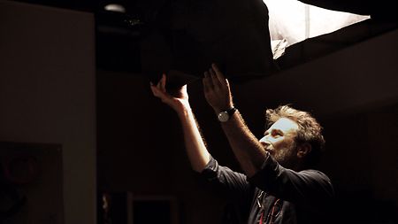
DP Italo Petriccione had nine weeks of shooting for “The Return of Casanova” at different locations in Italy
Were there any particular practical difficulties in filming at certain locations?
There is a scene in which Casanova returns to Venice at dawn in a gondola, and one in which the director is visiting the Venice Film Festival. Shooting in Venice is complicated in itself but having a whole scene at dawn, and, what's more, with an eighteenth-century setting, made everything even more difficult. We only had about 40 minutes to shoot before we would be invaded by tourists and boat traffic. We had to follow Casanova who, in a gondola, admired his Venice after years of exile. In the end, we finished shooting just in time, using a support boat on which a modular crane was mounted and a second camera on land to film the passage of the gondola from the bridges and between the streets. Once the last take was over, all hell broke loose among the tourists, vaporettos, and cruise ships! We then filmed the finale of the modern part on the red carpet of the Venice Film Festival. There, in addition to a strict protocol with cameramen and assistants in suits and ties and a meticulous police check, we had to adapt to the situation. A part of the shoot was rebuilt after midnight when the screenings were over. I had a Chroma Key put in the big screen that showed the film trailers and I had the collaboration of the festival’s lighting manager, who allowed me to turn off or adjust the existing system, to which I made small additions.
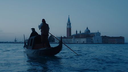
In one scene of the film, Casanova returns to Venice at dawn in a gondola
What lenses did you use?
For the contemporary shots I used ARRI Signature Primes on large format, while for the costume parts I used a series of vintage Cooke Pancro on Super 35 format. To differentiate the two eras with color and black and white, using sensor formats and lenses with such different optical designs seemed the right approach to me. I was familiar with the Cooke Pancro, since I had shot my first three films with it. The Signature Primes struck me for their refined optical quality and the wonderful bokeh they create in the focal planes. The black-and-white part gave us great satisfaction. The full format associated with the Signature Primes excited me with the compact image of such a large sensor. These wonderful lenses have been invaluable to me with their transparency and etching. They remind me of the legendary Panavision Primo Lenses, but with a unique bokeh. I've also mounted Sigmas on drones (the vintage Cooke series was too valuable to risk) and Swing & Shift for some reminiscence scenes.
What was your lighting system?
One day, the famous Italian cinematographer Tonino Delli Colli told me: “Italo, remember: never turn on a second light if you are not satisfied with the first one. Don’t use the second one to fix the mistakes of the first one!” And he added: “The first light you turn on will determine the course of the day.” This is advice I’ve always followed. I first choose the main light and its direction. Once it’s placed and well metered, I move on to the “trims.” This way, I only make small adjustments to the various cuts and have great continuity between shots.
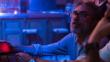
DP Italo Petriccione: “The first light you turn on will determine the course of the day.”
What added value did the ARRI lights provide?
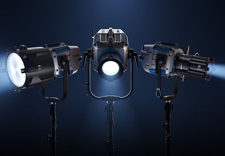
I have always preferred ARRI lights. In the past, discharge and incandescent fixtures, with their reliable construction and generous Fresnels, have been the basis of my kit. Lately, with the advent of LEDs, ARRI SkyPanels have become essential to me, and on this film I was able to try out the ARRI Orbiters as well. The ability to remotely control all the parameters, combined with the vast array of accessories and softboxes, was an invaluable experience. In a location complicated by logistics, the Orbiters solved the control of three large windows very well. I believe that in a few years, we will be able to have the same power of the ARRIMAX (which I always take with me!) with LED technology.
To what extent did you use on-set monitoring? What was the workflow? Was there a DIT?
I developed—together with colorist Cristian Gazzi and my DIT Flavio Tucci—a couple of LUTs for both eras. On set, we modified them according to our needs. With my way of working, the shot is 80 – 90% close to the final result, without lengthening the set time in any way. I tend to do most of the work on the shoot and keep the color correction for the finishing touches. I believe that showing a good level of finishing keeps the departments involved, as they can see the visual direction of the project right away. This also allows the director to deal with more stimulating material on the shoot and later in the editing phase.
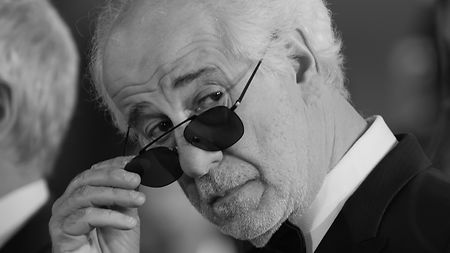
On set, DP Italo Petriccione checked the progress of the photography with stills of every shot
How did you look at the footage?
I always check the footage carefully during the shoot, so I prefer to have a still of each shot on Dropbox that allows me to check the progress of the photography in the evening. I don't willingly stand at the camera but prefer to stand at the monitor with the DIT so I can focus better on the image. I have been collaborating for more than 25 years with Fabrizio Vicari, a sophisticated operator, and we are in complete harmony.
What’s the next film you’ll be working on?
I am preparing Claudio Bisio’s first film as a director, a very engaging children’s story based on Fabio Bartolomei’s novel “L’ultima volta che siamo stati bambini.” A road movie set in 1943 in which I would like to use Signature Primes again.
Opening image: Italo Petriccione
Technical equipment provided by D-Vision Movie People
