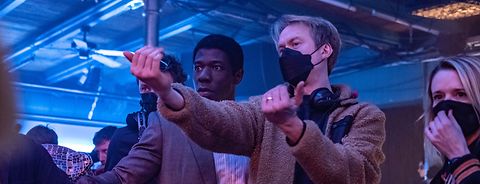
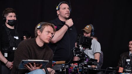
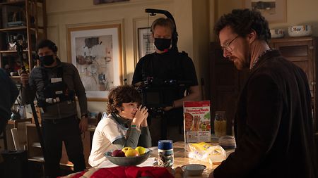
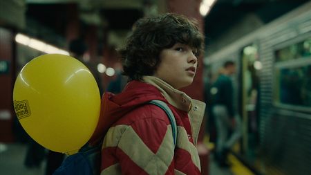
Shooting “Eric,” DP Spence became fond of the ALEXA 35’s Enhanced Sensitivity mode (Credit: Netflix)

Developing a 1980s NYC look for Netflix’s “Eric”

DP Benedict Spence BSC and colorist Toby Tomkins speak to ARRI about visualizing New York City in the 1980s for the six-part Netflix series, captured with ALEXA 35.

Jun. 25, 2024

Now available to stream on Netflix, “Eric” stars Benedict Cumberbatch as Vincent, a puppeteer whose nine-year-old son Edgar goes missing in New York City. His anguish and frantic searching lead him down a path that alienates him from his wife and associates as he becomes convinced that a seven-foot monster puppet called Eric holds the key to finding Edgar. Written by Abi Morgan and directed by Lucy Forbes, the series was shot with an ALEXA 35 package from ARRI Rental by cinematographer Benedict Spence BSC, who worked with colorist Toby Tomkins in preproduction and post to develop a look that evoked the period and felt right for the story. Benedict and Toby speak here about their collaboration.

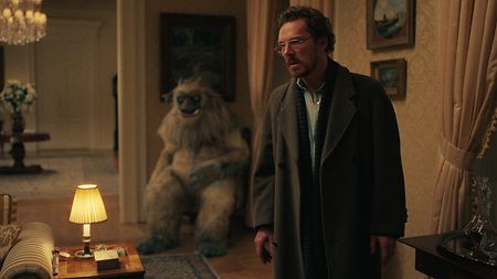
Protagonist Vincent (Benedict Cumberbatch) becomes convinced that monster puppet Eric holds the key to finding his missing son in 1980s New York City (Credit: Netflix)

Protagonist Vincent (Benedict Cumberbatch) with monster puppet Eric in the background

What were your initial ideas about a look that would work for the show?

Benedict Spence: Immediately you think of New York in the 1980s as grungy and messy and dirty, but it’s also an exciting place of creativity, music, and art, and there are great visual opportunities with both. When I was brought onto the project, Lucy already had some references and notes about the look, so we started bouncing ideas back and forth. We wanted to create a world that pulls viewers in, immersing them in 1980s NYC. I was very keen on shooting and lighting it like a modern high-end TV series, but with a feeling of something from the past; all our choices on the show sprung from that one creative desire. Lucy and I had collaborated with Toby a number of times; he’s a brilliant colorist and we were lucky enough to get him involved early on. 

Toby Tomkins: We knew we wanted film emulation vibes of the era, but we didn’t know specifically what until we had some material. Benedict and I pushed for decent screen tests with the actors in costume, on location, and lit as it would be, maybe slightly better than it would be, given TV shooting schedules. It meant we had material that we could play around with and see what worked best for the world that Lucy and Benedict were trying to create. 

Benedict Spence: We shot the actors on our apartment set. Toby and I graded the footage and from that, Toby generated a show LUT to gently emulate our look. I think it’s good having a LUT that gets you in the ballpark of the image you want, because it brings everybody along for the journey. When we got to the final grade, everyone knew roughly what to expect. 
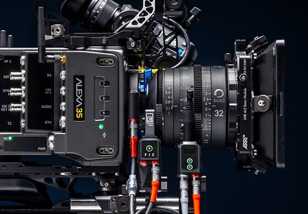
Benedict, you’ve worked very well in large format on recent projects; what made you turn to Super 35 for “Eric”?

Benedict Spence: The ALEXA 35 had only just come out when we went into production, but I knew what it was capable of in terms of color and dynamic range, and I wanted to give it a go. Initially, I was a bit worried about jumping back down to Super 35 and leaving behind the three-dimensionality of large format, but I got used to it again within ten minutes on set and didn’t miss the shallow depth of field of the larger sensor. One of the things I love about ARRI cameras is their ability to hold highlights and look after me as a DP, so I knew the ALEXA 35 would give us a beautifully filmic roll-off, and the dynamic range allows you to work fast with multiple cameras on a tight TV schedule, because you can concentrate on the bigger picture without having to sweat the small stuff. Super 35 also gave us a better choice of zoom lenses, and zooms were an important tool on this show for audience clues and red herrings. 

I knew the ALEXA 35 would give us a beautifully filmic roll-off, and the dynamic range allows you to work fast with multiple cameras on a tight TV schedule, because you can concentrate on the bigger picture without having to sweat the small stuff. 

Benedict Spence BSC

Cinematographer

Can you describe some of the thinking behind your approach to color?

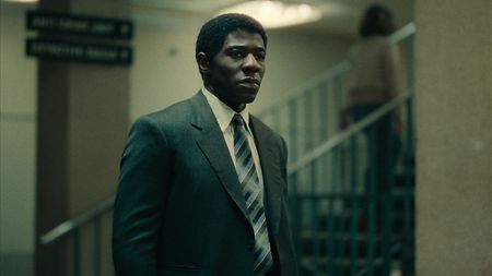
Toby Tomkins: There are two worlds that you see, commenting on the class system and homelessness in the 1980s. There’s the opulent warmth of the Upper West Side and then there’s the underground, which is played a lot cooler. The scenes with those underground characters are generally colder and starker, with lots of blues, cyans, and greens. But there wasn’t a strict color plan and Benedict often likes to have a mix of color temperatures in scenes. For example, the police station has this green, tealy look, but also loads of orange light sources, so there’s a mix of green and red-orange, which was a really nice palette to work with. 
 
Benedict Spence: We had a number of scenes in a nightclub, where we used a red wash for the backstage area. You’ve got to be really careful with those colored washes. They can look quite dull on digital because you’re trying not to clip, say, the red channel, if you’re doing a red colored wash. But the highlight retention of the ALEXA 35 means that it holds onto colors in the highlights, so it handled that sort of color wash amazingly, head and shoulders better than any other camera I’ve used.  

The color palette of “Eric” changes from the opulent warmth of the Upper East Side to cooler looks in the underground system and police station (Credit: Netflix)

The color palette of “Eric” changes from opulent warmth to cooler looks in different scenes and locations

You mentioned scenes showing the underbelly of 1980s New York—did you feel you had as much protection and creative freedom in the shadows as you did in the highlights?

Benedict Spence: Yes, I had at least another stop in the shadows with the ALEXA 35. Because I didn’t need to push the camera to hold the highlights, I found myself shooting between 640 and 1280 ISO and suddenly I’ve got more information in the dark areas of the picture. There are always times in the grade when you want to lift someone’s face in the darkness, so having that extra information is very useful. In particular I loved the camera’s Enhanced Sensitivity (ES) mode. There were moments on set where Lucy or I wanted to shoot a little bit of 50 fps when it hadn’t been planned, or where we wanted to use a zoom but the lighting hadn’t been set up for the slower T-stop of a zoom. ES mode gives you those extra stops of sensitivity, allowing me to say yes to a creative request, instead of no. I think we enabled ES mode in the camera two or three times per episode and I didn’t notice any artefacts. 

Was the grain in the images done in-camera or in post?

Benedict Spence: The grain was done completely in post. There’s a nice texture to the camera straight out of the box, but we wanted something a bit heavier. So, as well as doing beautiful color work, Toby also did a lot of film emulation work. That meant adding a bit of grain, a fair bit of halation, including a fun, filmic, rem-jet halation, where you see little red bits around some of the highlights, which looks brilliant and always excites me. 

Toby Tomkins: We did several tests with varying grain sizes and intensities, and then Netflix kindly put it on their platform so that we could watch it on Netflix, on various devices, and find the sweet spot. The halation immediately instils this vintage film look and evokes some of the cheaper, more consumer film stocks of the era. I think if viewers specifically notice it, then we’ve probably overcooked it, so we’re hoping it’s something that most people just feel. The insane latitude of the ALEXA 35 meant we could have more halation on the stuff that’s six or seven stops over-exposed, rather than just the stuff that’s four or five over.  

The filmmakers did several tests with varying grain sizes and intensities for “Eric” (Credit: Netflix)

The filmmakers did several tests with varying grain sizes and intensities for “Eric”

What were your other areas of focus in the final grade?

Benedict Spence: I think essentially the image we wanted to create for “Eric” was a slightly broken image, not necessarily filmic per se, and definitely not retro, but something slightly broken and slightly out of time. In the grade we actually ended up crunching a lot of shadows and occasionally burning out the highlights in a nice filmic way, not in a horrible digital way. We started with this enormous dynamic range and then we were squeezing it down and breaking it in lots of places. 
 
Toby Tomkins: For reference we looked at reversal stocks and things that have an extremely limited dynamic range. The way in which film overexposes or blows out is an organic roll-off; even though there’s not a lot of definition in the detail, there’s still something there. It doesn’t feel like digital clipping. So even though we were compressing the hell out of the ALEXA 35 images to get that lovely shoulder, it felt more organic than if we’d used a different camera that clipped some of the detail and then brought the rest of the range up. We were just compressing detail that was already there in the scene. 

How did HDR fit into your workflow?

Benedict Spence: I have done previous shows with some basic on-set HDR monitoring and to be honest I find it quite distracting. I’ve yet to see an HDR monitoring system which works in the way that one actually grades HDR stuff, so on set I just trust the camera to look after me and leave that particular work for the grade. For the gently retro, out-of-time look of “Eric” you wouldn’t want a really strong HDR grade with incredibly bright highlights. 
 
Toby Tomkins: Even though the primary delivery was HDR, we built the show LUT in SDR because Benedict and I agreed that the SDR roll-off in the highlights suited the project more than something hyper-real or visceral, as full HDR would be. We knew our look would translate well to HDR, which isn’t always the case. When it came to finishing, we swapped to an HDR display rendering transform and then tweaked the highlight roll-off until we found a sweet spot between something that was filmic with a soft shoulder, but also a bit more contemporary. The expanded highlight tonality of HDR gave us more texture and color in the highlights, which we could never do in SDR. 

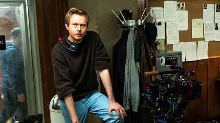
Three creative chefs were involved in finding the right look for “Eric”: Director Lucy Forbes, DP Benedict Spence, and colorist Toby Tomkins (Credit: Netflix)

Even though the primary delivery was HDR, colorist Toby Tomkins built the show LUT in SDR

Looking back, how was your overall collaborative experience on this project?

Benedict Spence: I feel very lucky to work with Toby; he just makes things look amazing! We had about 30 days grading six episodes and it was really nice. Around 50 percent of the time we’re working with what’s there to tell the story, 30 percent of the time is Toby making things look much better, and 20 percent is him really digging in hard to fix things that we weren’t able to get right on set, or that need altering to work in the edit. So yeah, Toby is a creative genius, but also a real lifesaver to me as a DP. 
 
Toby Tomkins: It was lovely. It was our third TV show together, and with director Lucy Forbes as well, and it’s a really collaborative three-way. It doesn’t feel like there’s a strict hierarchy, there’s just the three of us figuring things out. Most of the time we’re very well aligned, but color is such a subjective thing. It’s nice to work with people who understand that, and we can all chat about it and find solutions together. I think it’s beneficial when you have the sum of three creative chefs and the end result is better for it. 
 
Opening image: Netflix