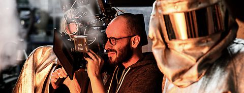
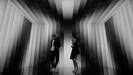
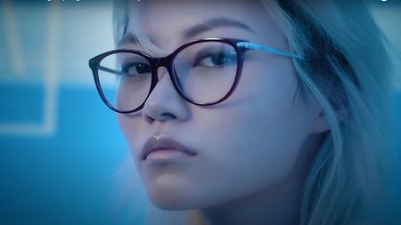
For Baci Perugina, “bright colors that popped out of the screen” were used to mimic the chocolate’s packaging
What visual cues did you have for the Baci Perugina commercial?
The idea of director Giulio Volpe was to stay very simple in order to focus as much as possible on the human aspect of the film. Since we had to portray the most diverse types of people—from children and young adults to the elderly of the most diverse ethnicities—the interesting challenge was to create portrait setups of light that could enhance everyone in the best way.
What precautions did you use to achieve the result?
A lot of casting work was done. This was a film about people, technique had to be invisible. There was a lot of work done on looks, with a focus on humanity, without flare and backlighting. It was necessary to create a light that would work well for both a middle-aged man, emphasizing his masculinity and more pronounced features, and the face of a young girl, without it looking flat.
What camera did you use, and why?
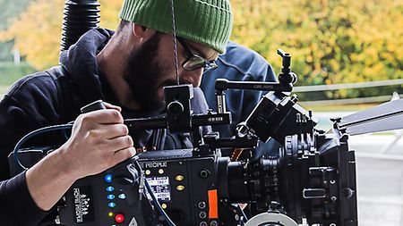
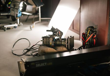
I used the ALEXA Mini LF. We had to handle bright colors that popped out of the screen, a saturated aesthetic typical of Dolce & Gabbana's style. We started with the pattern of the set design, which was similar to the packaging of this version of Baci Perugina chocolates.
Why Large Format?
I wanted to approach the world of portraits with the wider format. I'm not a big fan of wide angles, but on large format portraits they look better; they have a great rendering of three-dimensionality and space. The larger the sensor, the better the rendition.
What lenses did you use?
We used ARRI Signature Primes because they are transparent and beautiful on complexions.
What has been your experience with Signature Prime lenses?
It is impressive how Signature Prime lenses can simultaneously render very high resolution and be kind to skin and people even in extreme close-ups. Their micro-contrast is an ideal starting point for creating elegant images that are not overly artificial.
Did you use a LUT?
Yes, the one prepared by colorist Giorgia Meacci, which lowered the greens a bit, increased the contrasts, and enriched the complexions, all in order to get closer to the pop aesthetic required for the product.
What was the lighting system?
Depending on the subject, we used slightly different systems to change the tone: discharge lamps for one subject and ARRI SkyPanels for the other. For one subject we opted for a kinder, institutional, soft light, for another something closer to sunlight, with discharge lamps. I am excited about the combination of the ALEXA Mini LF and SkyPanels. Their strength is that they speak the same language, that they are developed from the same color science. They produce beautiful shades, there are no tint problems, and they do not emphasize dyschromia on the skin, on the contrary.
